Announcement

Died in a Blogging Accident has lived up to its name and died... in a blogging accident. That is to say it has concluded. You can still re-live the magic by clicking here to start at chapter 1. For genuine criticism of XKCD, please click the top link to the right (XKCD Isn't Funny).

Wednesday, December 25, 2013

Died in a Blogging Accident: Sneak Peek!

UPDATE July 2014 – Died In A Blogging accident can now be found here!

------

Happy Christmas to all you goyim. Since you're checking the blog on Christmas Fucking Day, I assume you have no family, or you are one of the chosen people. Either way you deserve a present. Allow me to give you a preview of chapter 3

------

Thank you for your interest, but this preview was intended only for viewers over the Christmas period, and has now been removed. If you want to see chapter 3, please wait until it comes out in the summer. See you then! And keep tweeting #DiaBA!

Friday, December 20, 2013

COMING SOON TO XKCD-SUCKS


http://feeds.feedburner.com/blogspot/HJZaO


Wednesday, December 18, 2013

Comics 1299-1305: Who Will Remember Us?

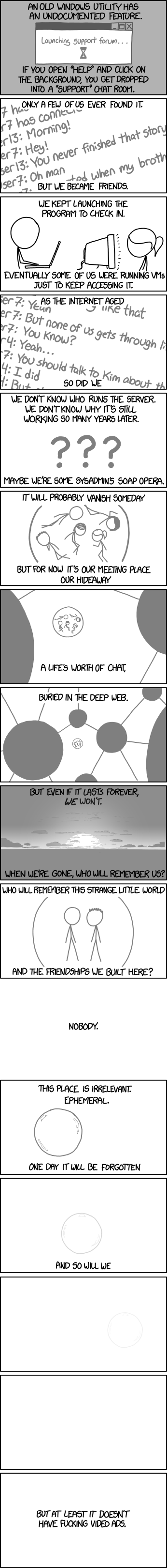
Comic 1305: Undocumented Feature

Click here, or anywhere on the image, to see the full-sized version. Trust me, it's worth it. I will wait.

I just, wow, this Xkcd hits home in so many ways. A many-panel skyscraper of a comic, reminiscent of the the glory days of SMBC. The artwork is effective and to the point. But what really make me want to re-read this comic is the story it tells.

I think the subject matter of this comic is something we can all relate to. This comic is fictitious, but it captures the experience of so many online backwater communities. It ends with a punchline about Facebook and an alt text about Youtube, but that is only to emphasise the contrast between those sites and the little misfit communities that we create ourselves.

And yes, Xkcd-sucks is one of those communities, whether you spell it with a hyphen or not. Look in any comment thread and you will see the friendships we have built. We were just trying to troll each other, but in was in fact the trolling that helped bring us together.

Furthermore, this comic is an important reminder that all online communities will eventually die. You don't have to be particularly observant to see that has already began to happen. No-hyphen doesn't update anymore. The comment threads are closed. And that has not produced the huge influx of activity to this blog that I expected.

People leaving No-hyphen are not going elsewhere to hate Xkcd. They are just leaving, for the same reasons that Rob is no longer posting. Their hate is turning to apathy. It's no longer fun to hate Xkcd.

With that in mind, I have decided to stop reviewing Xkcd. This blog will be retired, and Xkcd-sucks will die.

So in light of everything I have said, I will give this comic the grade it truly deserves, complete with something I have been waiting to say in earnest for all these years: A* for Randall Get Out Out Of My Head.

That does not mean the previous six Xkcds are exempt from criticism. These will be the last reviews I write, so I might as well make them count.

Comic 1304: Glass Trolling

B- for trolling Google Glass. It's something that deserves to be trolled, but the troll was not original. F for the fact that obnoxious Xkcd fans everywhere are going to copy this comic, because of course they are.  Just imagine a million of them uttering 'OK Glass' commands while they needlessly chatter at their smartphones. Worst of all, there already is a feature on Nexus phones that's pretty much the same thing, except you say 'OK Google Now'. And with this comic being the bad influence that it is, people might actually start using it. Randall, do you even know what you have inflicted on humanity with this simple PNG image? Instead of mocking the stupid trend of talking to electronics, you have helped perpetuate it!

D for artwork, and for not even going to the effort of drawing a second person. DETENTION for Gizmodo repost.

Comic 1303: Profile Info

Nice idea, but there are so many ways in which it wouldn't work.

It wouldn't work for social networks, which is where we would most want to use this trick. How dumb would it look if every single comment you made on Youtube was signed 'John If-you-see-this-name-in-an-ad-give-the-product-a-one-star-review-smith'?

F- for failing to think things through any more than I thought through this grade.

DETENTION for Gizmodo repost.

Comic 1302: Year in Review

This comic failed to make a point. F- for lack of a point. Is the joke supposed to be that a newscaster talks about something completely irrelevant while on air. Whilst it's something we'd all like to see a newscaster do, it doesn't actually make for a good joke, because it's unoriginal as fuck. F-- for unoriginality.

And the worst part is that it's trying to be all zany and random, and it just fails dismally, because it's just what we expected. F for building up an expectation, and going nowhere with it.

C- for the alt text, but it was almost unrelated to the comic.

Comic 1301: File Extensions

I fail to see a joke in this one. I fail to see any way to apply this comic to my own experiences. You have to be scraping the bottom of the observational humour barrel to come up with stuff like 'oh yeah, pdf files are much more trustworthy than ppt files.

It doesn't even make sense on its own logic. I regularly convert my lecture slides from .ppt to .pdf to make them easier to read on a Mac. But that doesn't change their trustworthiness. Normally logic shouldn't matter, as it's just a comic. But when it fails to impress me in any other regard, logic becomes its only redeeming value. And the weak logic of the broad sweeping statements about file types, which is incidental to the content they contain, is the best thing about this comic. Doesn't that say a lot.

Oh yeah, Randall. Aren't your comics always in PNG format?

F for lack of logic. F- for lack of relevance. F-- for lack of a joke. DETENTION for Gizmodo repost.

Comic 1300: I Don't Own a TV

The following review is a tribute to Rob Mason, and his timelessly brevitic style of reviewing eveything.

Nobody cares. F

Comic 1299: Galilean Moons

This comic is just... what? This comic is awful beyond mere description of words. To wit one William Monty Hughes, "Words fail me [...] but I shall not fail words." So let's review this astronomical turd of a comic.

Why would one of the moons be so happy about escaping the girl's orbit, and orbiting the guy instead... unless it was planning to suck him off. Hey, that reminds me of my first ever comment. Nostalgia aside, it is so hard to see what this comic is on about. I had to turn to Explain Xkcd to help me in my final review, and the grades I had to give are:

*Deep breath!*

Q for bad artwork. R for failing to include show the moons' motion. S for not even including a dotted circle to show the orbit. T for the impossible-to-comprehend joke about orbital resonance. U for lack of standalone value due to it being a joke about orbital resonance. V because it's not even funny. W because apparently Galilean moons moons a don't do anything but say the same thing repeatedly. X because even if the moons somehow had the power of speech (and I reiterate: why the fuck?!) it would make no sense for one of them to shout "MOOOOOOON!" It's like the most annoying Pokemon with none of the good things about being a Pokemon. Y because not even the forums liked it. Z for making moons look like the astronomical equivalent of crabs.

Overall grade: Z*, that's a ZED-FUCKING-STAR (pun not intended thank you very much - a moon is not a star), the worst grade I have ever given. You know what that means?

100 BELT LASHINGS, one for every comic I have ever reviewed, for the WORST COMIC I HAVE EVER REVIEWED. 

*THWACK*
*THWACK*
*THWACK*
*THWACK*
*THWACK*
*THWACK*
*THWACK*
*THWACK*
*THWACK*
*THWACK*

*THWACK*
*THWACK*
*THWACK*
*THWACK*
*THWACK*
*THWACK*
*THWACK*
*THWACK*
*THWACK*
*THWACK*

*THWACK*
*THWACK*
*THWACK*
*THWACK*
*THWACK*
*THWACK*
*THWACK*
*THWACK*
*THWACK*
*THWACK*

*THWACK*
*THWACK*
*THWACK*
*THWACK*
*THWACK*
*THWACK*
*THWACK*
*THWACK*
*THWACK*
*THWACK*

*THWACK*
*THWACK*
*THWACK*
*THWACK*
*THWACK*
*THWACK*
*THWACK*
*THWACK*
*THWACK*
*THWACK*

*THWACK*
*THWACK*
*THWACK*
*THWACK*
*THWACK*
*THWACK*
*THWACK*
*THWACK*
*THWACK*
*THWACK*

*THWACK*
*THWACK*
*THWACK*
*THWACK*
*THWACK*
*THWACK*
*THWACK*
*THWACK*
*THWACK*
*THWACK*

*THWACK*
*THWACK*
*THWACK*
*THWACK*
*THWACK*
*THWACK*
*THWACK*
*THWACK*
*THWACK*
*THWACK*

*THWACK*
*THWACK*
*THWACK*
*THWACK*
*THWACK*
*THWACK*
*THWACK*
*THWACK*
*THWACK*
*THWACK*

*THWACK*
*THWACK*
*THWACK*
*THWACK*
*THWACK*
*THWACK*
*THWACK*
*THWACK*
*THWACK*
*THWACK*

And before I go, DOUBLE DETENTION for Gizmodo repost. Fuck you Gizmodo! FUCK YOU IN THE THUNDERBOLT PORT! AND FUCK EVERYTHING TO DO WITH FLAT DESIGN. ALSO WHOSE IDEA WAS IT TO PUT DRM ON A FUCKING USB CABLE?! FUCK YOU STEVE JOBS!!!!!! OY VEY.


*Ahem*

Before I go, I'd like to talk seriously for a moment. If comic 1305 is anything to go by, this community will soon be forgotten, even by those who participated in it. And that makes me truly deeply sad. But though we may go our separate ways and never even tell anyone that Xkcd-sucks was a thing, there is one thing that we will never lose: the fun we had from the comics we bashed and the friendships we made. Even if no one remembers it, it still happened. It was good while it lasted, and no one can take that away from us.

You know, I was never into MMO gaming, and Chat-rooms and BBSes were slightly before my time. So this was the closest I have been to a tight-knit online community that I felt I really belonged to. And you guys have been best, even the Anonymous, especially the Anonymous. The last few years have been the best of my life.

Feel free to share your best memories of hating Xkcd in the space below. Try to put this blog out of your mind when you see your families this Christmas. I wish you good luck, farewell, and have an easy feast.

And I never did finish that story...

Monday, December 2, 2013

Comics 1295-1298: Xkcd Sucks at Programming

What's this you say? Four comics in one review! But Jon, it's not an exact multiple of 3. To that I say, who gives a crap?

Comic 1298: Exoplanet Neighborhood


Well, let's start with the good. Randall get an A+ for the algorithm that makes the circles spaced out evenly. That kinda neat, and it must have been fun to do. Everything else on the other hand.

D for graphic design. This is basic stuff here. Don't depict planets as dirty brown discs. He has made this mistake before in 1071. Speaking of 1071, it's hard to see how that isn't a rehash of that comic. There are more planets, for one thing. The shape of the comic is rectangular rather than circular.

So what's the difference? Is it meant to show how more planets have been discovered since that comic was made. No. Read the text carefully: "Constructed from statistical data on typical planet sizes and orbits."

Oh, so they're not even real planets. It's just based on what we think might be out there. Yeah, I'm betting this comic will end up looking really dated in a few years when higher resolution telescopes prove that there are far more planets than this F for using damned lies and statistics in lieu of data.

Our models of planet formation are flawed. They don't even properly explain the origin of our own solar system. So applying that logic to other stars is flawed at best. Bear in mind that there is an observer bias in favour of large planets, because large planets are easier to spot. Small planets will probably be found to vastly outnumber gas giants when we get higher resolution telescopes. If our own solar system is anything to go by, then most gas giants will also have planet-sized moons.

So to sum up, F- for general scientific dickery.

F-- for being a poster. He probably made the background white to save on ink costs. Stingy bastard. Just look at how much better it looks with a black background. And all I did was invert the colours (and correct one of the spellings).


Oh, and F--- for forgetting to include an alt text, then hastily adding an alt-text-for-the-sake-of-an-alt-text a few hours later. Don't think I didn't notice.

Comic 1297: Oort Cloud


B for referencing a current event. Not everyone has heard of Comet Ison, but the comic is just about readable without that knowledge, so A- for standalone value.

Does the time scale used in the comic bug you? Because it bugs me. Most comets have orbital periods in the hundreds of years, if not thousands. Certainly it would take at least that long to reach the Oort Cloud.

Fun fact: the Oort Cloud is far away, like really far. If it take light 4 hours to reach Neptune, what we traditionally regard as the 'edge' of the solar system, then you'd be looking at at least 4 months to reach the Oort Cloud. And since the comic does nothing to even imply this vast distance, that's a big fat F for having no sense of scale.

This sounds like nitpicking, but think about this. It would not have hurt the comic at all if there was a '3000 years later' caption between the 2nd and 3rd panels. It would have actually improved the joke somewhat. The idea of two friendly comets picking up a conversation after 3000 years is a funny one. F- for missed opportunity.

Now it's time for the nitpicks. D for failing to show motion, and D- for the stilted dialog.

This is another clear-cut case of comic that he should have run by an editor, because it was actually a good idea, but good execution would have really enabled it to shine like a dying comet in the sun's corona.

Comic 1296: Git Commit


We get it, Randall sucks at programming. This is not how you are supposed to program. As Ars Technica (the wise old sage of tech journalism) will tell you, you are supposed to write code that other people can understand.

F for making a joke out of 'I suck at programming.' But wait. There's more to it than that. It's a great big GOOMH* moment to Xkcd readers who are also programmers. In fact, I imagine it's the sort of thing that pgrogrammers encounter all the time when they make small incremental edits to their code. It's probably stating the bloody bleeding obvious to these people, so no joke. F** for stating the obvious, but they'll still appreciate the GOOMH anyway, because it's Xkcd.

C- for standalone value, as half the comic's readership will probably be scratching their heads and wondering what a 'Git Commit' is, if it's not obvious from the context (it isn't).

Comic 1295: New Study


Randall shakes his fist at the TV like a bitter old man bemoaning the fact that radio is ruining music. The viewer sighed at yet another Xkcd comic complaining about TV news stations appeared on his Feedly dashboard. This comic gets a D for just being boring. D+ for artwork, which is a little on the lazy side, but at least the guy doesn't have a floating head.

Of course, we all know that Randall wishes that everyone would get their science news by reading the science-themed Xkcds, then googling some of the terms they mention so they can understand the punchlines. If Randall got his way, he'd replace science news with science homework. Fuck you, Randall.

*In case you're a new reader, it stands for 'Get out of my head'.
**It's not asterisks. It's two stars, you fuckers.

Saturday, November 23, 2013

Comics 1283-1294: Fuck You All

Well, the last four weeks of comics have had nothing wrong with them, so there's really not much for me to say. JUST JOKING, THEY ALL SUCKED. Here's why.

1294 - Telescope Names

The premise of the joke is the first thing that's weak. for bad premise. It's basically a variation on the 'what if they ran out of names for  a particular thing?' gag that he did back in the 'hurricane eggbeater' comic (too lazy to look up the number). It wasn't funny then, and it's not funny now. F+ for recycled joke, because he could have picked worse ones to recycle. Then there's the terrible execution. It's just a bunch of text with some check boxes. I could have drawn that. F* for laziness.

Also, why is there are tick in the box if it's cancelled. Surely there should be a cross or a straight line. for not thinking things through.

1293 - Job Interview

I think we've all heard the story that Beret guy is supposedly based on Randall's real friends. If that's true, then Randall is obviously trying to mercilessly mock this friend, and the guy just doesn't get it.

F for the bad dialog. You can see painfully clearly that certain lines like 'There are ghosts here.' and 'I hope so.' were just generated by a Beret Non-sequitur generator script, probably one that Randall wrote himself in Python. F for doing a mediocre job of it. Your programming sucks, Randall!

Other lines that came out of the generator included (and I'm just guessing here) 'Are you a zombie?' and 'Really? I thought this was a bakery.'

F* for missing out the panel border in the middle panel. Is it a stylistic choice? Looks like the fucker was too lazy just to draw the fucking panel border, even though it only takes like four seconds with the rectangle tool.

1292 - Pi vs. Tau

F* for referencing the pi vs tau debate, which is one of the stupidest arguments on the Internet today, and that's coming from a guy who reads a bunch of tech blogs where people are arguing about Apple vs Android ALL THE FUCKING TIME.

The reason it's a stupid debate is because no one is going to change 2000 years of textbooks, and render the old symbol obsolete just because some people on the Internet said so. Tau may be better, but it doesn't matter. We're stuck with pi. deal with it.

I'm giving Randall another F* just because this comic is flame bait for the worst kind of nerd. Oh, and F for the alt text. No one uses the octal system, dumbass.

1291 - Shoot for the Moon

I, uh, what the fuck is this? Who let Megan out of her ball pit? And who is the talking to? I NEED TO KNOW. Because this comic makes no sense, my grade is not going to make any sense either. ÌÏÓÔ for bloody everything.

1290 - Syllable Planning

I'm going to give this comic an F*- because it appears to be mocking people who insert fucking into the middle of words. And if it isn't? Who cares? I still hate it. Another F for the premise of the joke, which is founded on the idea that you can't say 'ridicu-fucking-lous'. I just said it! It didn't sound wrong. Your argument is invalid, Ran-fucking-dall.

If you're so smart, tell me where in the word ridiculous would be a better place to insert fucking. There is none. 'Ri-fucking-diculous' and 'ridic-fucking-ulous' both sound worse than 'ridicu-fucking-lous'. Randall, you get an F* for failing to think things through.

1289 - Simple Answers

I choose to counter this comic with my own.


Also, F for smug preachiness, or something. DETENTION for Gizmodo repost.

1288 - Substitutions

Another list comic. F for being another list comic. F for recycling the joke from the keyboard/leopard comic. F* for comparing the noble sport of eating contests to elections. Did you know this blog becomes more fun if you replace 'Xkcd' with 'The New Testament'? You do now.

1287 - Puzzle

F* for the terrible confusing notation in the alt text. The white queen can't even get to the square B8, so it makes no sense anyway. Or am I just reading it wrong. Let me know in the comments.

1286 - Encryptic


And calling it 'wonderful' is a bit of an overstatement. F for casual hyperbole. And does Randall really think it's 'wonderful' that all these passwords have been leaked to the public? Sure he does, because it means he gets to preach to them about password security while they scramble to change the password, a password they didn't even want in the first place. Bah. Another F because it also scares uninformed people about passwords. F* for having no coherent characters.

DETENTION for Gizmodo repost.

1285 - Third Way

F* for recycling the joke of the Pi vs Tau comic, except this one came first, so... shit. F* anyway.

1284 - Improved Keyboard

I am getting an insufferable smugness vibe from this comic. F for smugness. And even more annoyingly, it's Black Hat who's being the smug one. F* for abusing the character of Black Hat. And F*** for more smugness.

1283 - Headlines

F for no characters. F for no joke. F for no artwork. F for no dignity. F for no shame. The flaws of this comic could apply to almost any one. FFFFFFFFFFFFFFFFFFFFFFFFFFFFFFFFFFFFell asleep on the F key. DETENTION for Gizmodo repost. Gizmodo gets a detention as well. Apparently The Guardian reposted this one as well, Britain's last broadsheet. I mean, fuck. What has the world come to? Xkcd is everywhere. Is it even worth trying to fight it anymore? We are the last soldiers in the war on Xkcd. Maybe we've lost. Maybe we'd be happier if we just gave in to the madness. Let me know in the comments section as I shed a single tear for the death of art.

*It's not an asterisk, fuckers. It's a STAR.

Tuesday, November 5, 2013

Comics 1280-1282: Oh, we're halfway there

Have you heard that they're phasing out alphabetical grades in the British GCSE system? That means their getting rid of the A* grade, and I for one think it's a travesty. Future generations' grades be made better through association with a celestial body. You can rest assured that xkcd-sucks will continue to use alphabetical grades for the foreseeable future. Now on with the reviews.

Comic 1282: Monty Hall

I know it's making reference to a semi-obscure logic problem, yet it's sort of essential to understanding the joke. And it has Beret, second only to Black Hat in his inconsistency as a character. And yet I just can't criticise it. Missing the point of the Monty Hall problem and taking the goat instead strikes like 'typical Beret' and 'something Beret would do'. Furthermore, it's so damn cute. So yeah, A* for just being a perfectly heartwarming comic, and doing what xkcd should do more often. Oh and the alt text is just perfect.

Comic 1281: Minifigs

Liking two xkcds in a row? What's wrong with me? Hear me out here. It may be a graph joke, but it's a good graph joke. A* for concept. The concept of Lego people outnumbering human people is not funny in itself. But it's something that no one else has thought of. Having said that, someone probably has thought of it before. It also gains A* bonus points for being true (probably).

The execution is really great too. This may be a happy accident from the data he's got, but he's labelled the graph so that the label for the 'unfunny' world population graph is what you read first, and then you read the 'funny' data for the world lego population. A for comic timing and data presentation.

B- for the actual punchline though. It feels a little bit like post-punchline dialog, or repeating what the reader already knows. He'd only have to do one thing to improve it. Move the caption to the top, so it's the first thing the reader sees. As it is, the title telegraphs the punchline too much, so maybe change it to something like 'Outnumbered'. Then it would be perfect.

I'm losing it as a critic. I never claimed to be objective, but I can't hate xkcd when I need to. Let's see if the next comic is any improvement...

Comic 1280: Mystery News


Ah, that's more like it. D for concept. E for execution. F for humour. 'Most of my news' is absurdly exaggerated, and not even in a funny way. If I ever get one of those awful auto-playing videos and I can't find the tab it's playing from, I don't stop and listen to it, like this comic implies. F- for implying that anyone would do that, EVER. I usually resort to more drastic measures to avoid listening, like systematically destroying all 6 million tabs pressing the mute button. It would be funny if... no, I got nothing. Also, DETENTION for Gizmodo repost.

Yes I know I'm a week behind. Remaining comics to follow shortly.

Monday, October 21, 2013

Comics 1277-1279: My Secret Shame

If you are using a mobile device, then email me and I will personally send the alt texts to you. I am not even joking.

Comic 1279: Reverse Identity Theft


This is a good idea, ruined by bad execution. I would have liked to see a multi-panel comic in which someone with an email address in the format of firstname.lastname@ gets a deluge of emails from services he/she never signed up for, and eventually pieces together the puzzle at the same time as the reader does. But instead, this skips to the conclusion of the story. Randall gets paid by the poster, not by the panel.

B+ for idea. D+ for timing. D for wall of text. D- for essay length alt text. F for general laziness. And DETENTION for Gizmodo repost.

You may think I'm being too harsh, but I have noticed a lot of xkcds lately that fall flat because I don't actually realise what they're about until I read the punchline, and then I have to re-read the rest of the comic to complete the joke. It's sloppy. Someone brought up this same point about 1271 last week, and I have to agree.

Comic 1278: Giraffes


Now this is what I prefer to see from an xkcd comic. Simple yet effective. It's science-y, but not confusing or intrinsic. B for humour, which is enhanced by an A for standalone value. A for delivery - you don't need to overcomplicate a joke like this, and he didn't. C for the 'my hobby' format, which I feel it didn't really apply to this comic as much as some of the others.

Comic 1277: Ayn Random


I don't want to admit that I liked this comic. So I'll just get the grades out of the way first. F for people sitting at computers. D+ for stilted dialog. D- for White Hat as the obvious straw-man. F- for the external reference that will confuse many readers.

For those who don't know, Ayn Rand is an author who wrote some very preachy (and boring) books, most notably Atlas Shrugged (which Randall once referenced in comic 1049). He basically said that people are better when they work on their own and don't try to help each other. He explained the amount of unfairness in the world by saying that some people are intrinsically better than others. There. You've learned something. Did that make the comic funnier? No. You had to know that BEFORE you read the comic.

Fortunately for me, I already knew that. AND I LAUGHED MY FUCKING HEAD OFF. And it was an annoyingly high-pitched laugh. You haven't heard my laugh, but it sounds just like British comedian Jimmy Carr's famously annoying howl. It is the sort of thing that can't really be described in mere words, but this video will do:


I feel dirty now. I'm not sure if I can carry on as an Xkcd reviewer with the knowledge of this out in the public. Please tell me in the comments if there are any other Xkcd comics you laughed at, but shouldn't have. It might make me feel better.

Tuesday, October 15, 2013

Comics 1268-1276: XKCD-SUCKS TRIPLE BUMPER EDITION!

Comic 1276: Angular Size


I want to like this comic, I really do. And I would like it, if it weren't for this one great big glaring error that I just can't look past.


You ignorant yankee schmendrick, Randall! The UK does not have any 'freeways'. We have motorways. It's like a freeway, except you drive on the left. I cannot understate the importance of this simple semantic error. You have disfigured an otherwise good comic with this grotesque transatlantic slur. FFFFFFFFF----------------------- for failing to brit-pick.

Ah, it's good to be back.

In all seriousness though, I should mark this comic down for being poster bait. But it's not visually appealing enough to be a poster. I don't personally think there is anything wrong with poster bait. They are usually the best Xkcd comics. However, I would get tired of looking at them if they were on my wall. Do I get annoyed that other people spend their hard-earned cash on them? Of course, but there will always be meshuginas in the world.

Comic 1275: int(pi)


F for dumb programming joke. A for it actually being quite good. F- for terrible artwork that should have been replaced by plain text. A+ for great alt text that should have been part of the actual comic. 

Comic 1274: Open Letter


Ughh, F for dumb programming... no wait, that's the previous comic. In that case I make it an F for plain text artwork. D for wall of text. C+ for a good joke, and B+ for it being topical.

To be honest though, topicality can go fuck itself. I prefer timeless to topical. And when every other news site is spitting out terrible knee-jerk reactions that will forgotten a day later, one begins to question how important it is for content to be current up to the hour.

And most of an Xkcd comic's audience probably comes from people looking through the archives, fingers on the random button until they can be sure they have seen every single one, and they don't care when they were made.

The best things last. Topical content is nice if we come across it years after the fact and it reminds us of the event. But its importance is overstated, particularly by detractors like me.

Comic 1273: Tall Infographics


A+ for taking a dig at infographic designers! This is also a field Randall himself has dabbled in, so A for self-deprecation. Another A for effective use of colour in an Xkcd comic (haven't had that for a while). I've said it before, but if every comic was like this, then there would be no Xkcd-sucks.

Comic 1272: Shadowfacts


C- for a rather silly Lord of the Rings reference, which I probably would have appreciated more if I'd remembered that Gandalf's horse is called Shadowfax, instead of mentally analysing the comic for a few minutes and coming to that conclusion. Still, I can understand the humour if you had heard the name 'Shadowfax', and thought that it sounds a bit like 'Shadowfacts', and then saw this comic. C+ for GOOMH-bait. B for the punchline of 'Shut up.' It's a cliche, I know, but when used in the right context, it's instant laughter.

Comic 1271: Highlighting


Yes, it's GOOMH-bait, but it's good GOOMH-bait. So have an A. You don't have to be a person who obsessively highlights text to appreciate the funnyness of this comic, but someone who has done anything a bit like this will understand the general idea.

Unfortunately, the joke is presented in a somewhat opaque way. It's difficult to see what it's about until you read the punchline. So that's a C- for clarity. Let me know in the comments if you found it as difficult to read. In fact, post anything in the comments. I'm so alone.

Comic 1270: Functional


I can't tell who is supposed to be the butt of this joke. My logical side is telling me that the stick figure sitting at computer is being mocked for his weird programming fetish. On the other hand, White Hat is always drawn as Randall's strawman, so are we mocking him. But if that's true then there is no joke really. Let's just call it an F for lack of a joke. F- for stick figures sitting at computers, AGAIN. And B+ for good alt text.

Comic 1269: Privacy Opinions


Since this is a multi-part comic, I'll review it in multiple parts. C for the philosopher. A for the crypto nut, because those people deserve to be mocked. B for the conspiracist, although conspiracy jokes are a little overplayed. C for the Nihilist. So are nihilism jokes. A+ for the exhibitionist. It's predictable, but I stand by the fact that this is the best humour Xkcd has to offer. D for the sage, and Beret's complete lack of character traits.

Comic 1268: Alternate Universe


B for the panel. A for the alt text. Again, I feel he could have done more with this premise, and the humorous potential idea of living in an alternate universe where only a few things are different. This should have been a multi-panel comic, not a single panel throwaway. For that, I'm giving it a D- for wasted potential

Sunday, September 22, 2013

Comics 1265-1267: Does Xkcd Halt?

If you're browsing on a mobile device, please shoot yourself before you try to read the alt texts. Love you guys. By the way, has anyone used iOS 7 yet? It looks like Randall Munroe designed a mobile operating system! Share your flame wars in the comments, please. Oh wait, Blogger's comment box doesn't work on mobile browsers.

Comic 1267: Mess


Ah, the GOOMH-bait. Been a while since we've had something like that. The joke is something that some newspaper cartoon has probably covered in the last ten years, but it's not a bad joke and told well. C for humour, but F for originality.

The artwork, while not stand-out excellent, services the joke. B for artwork, and well done for trying. In a comic like this, I can't help be feel it would be nice to see the expressions on the stick figures' faces. Ah who am I kidding, Randall can't draw faces.

Comic 1266: Halting Problem

No.

Referencing an obscure computer science problem requires the reader to do their own research, thus ruining the pretence of the joke. Just look at all the people who googled it. This is unacceptable. And it also requires the reader to understand programming jargon. It's just the terms define and return, and you can sort of infer those terms from the context, but it ruins the comedic timing if you do so. I'm just gonna go ahead and give this a big fat F- for standalone value. I'd like to say it could be worse, but can it?

Even supposing the reader did know about the Halting Problem, what is the actual joke? It's about answering an unanswerable question with a simple and obviously wrong answer. It's equivalent to saying "The meaning of life is 42."Actually bad example. It's like if Douglas Adams published a book that contained nothing but that sentence. Do you not see how that would be bad. G-- for humour.

Now look at this:

DEFINE DoesItHalt(Program):
{
      RETURN True;
}

"The big picture solution to the halting problem"

This is a plain text adaptation of the above comic. Does it lose anything from the original? No. It also has the advantage of being 101 bytes instead of 7.5 kilobytes. If the comic can be adapted into plain text, then you really have to call into question whether it deserves to be an image or not. Comics are a visual medium, and the PNG image can display over 16 million unique colours. H--- for artwork, or lack thereof.

I would say this is the worst in a while, but we had a pretty bad one a few weeks ago.

Comic 1265: Juicer


I actually had to use explainxkcd.com to see if the joke is really what I think it is. As it turns out, it is. For those of you who needed a clue, the joke is that someone buys a juicer and uses it to extract the juice from sweets (candy if you're a yank). This has some humorous potential in it, but I don't think it was properly realised. B- for humour.

C- for artwork. I feel he could have added just a little shading on those juice bottles.

D for the alt text, which seems to contradict the joke itself.

And F- for using a brand name product. I'm sure there's cash changing hands under the table.

Monday, September 16, 2013

Reviewing The Classics: 77, 72, 12: Black Hat Guy Begins

No one can agree when Classic Xkcd finished, and when the new comics started sucking. The original xkcdsucks blog started at comic 409, a comic most, if not all newer readers, would assume belonged to the 'Classic Era'. But everyone always seems to agree on one thing: 'Xkcd was at its best before I started reading it.' That of course varies depending on when you started reading it. When you're browsing through the archives you can press the 'Random' button as many times as you want and skip past the bad comics. But once you slow down to three new comics a week, they start getting 'worse'? Mishegas I say! Xkcd has always sucked. And here I am going to prove it for you by giving you my honest opinion of three such 'classics'. Kill me before I use inverted commas any more.

Comic 77: Bored with the Internet


'But that was one of the best Xkcds!' I hear you say. Stop kvetching. I'm the one writing the review. The fact is, this would not pass as 'good' if it was released on xkcd.com today. At most, it would get a 2-page thread on the fora and a footnote on xkcdsucks.

Oh, and don't be thrown off by the appearance of Black Hat. He doesn't do anything Black-Hat-ish in this comic.

First, let's get the obvious things out of the way. C+ for artwork. Yes, The landscape is impressive, but only if you haven't read any other webcomics. It's just that every other panel doesn't measure up to it. Panel 3 gets a particularly crudely drawn crinkly line to represent a mountain range. F- for visual consistency. Furthermore, he can't seem to draw stick figures when they're walking. That is why they appear to be standing still in most panels, but Black hat is tripping over his own foot in panel 2, and doing some kind of athletic stretch in panel 3.

Now, are the two lines of dialog in panel 1 realistic? No, but at least it has few unnecessary words. And at least you can tell who's saying what. The final panel just has a line suspended in mid air, appearing to come from no one. D for clarity.

And I'm not sure if people thought this was fresh and original back in 2006, but I certainly don't. The joke is that someone tries to live without the internet, but can't. He actually did this joke again in 597, which was significantly funnier than this one. F- for humour. Don't worry Randall, at least you're not getting worse.

And the alt text? 'I used to do this all the time.' Really? I doubt it. F for lying.

Comic 72: Classhole


Uggh, a comic about two stick figures standing and talking in what may well be a white-coloured void. F-- for artwork, and I don't need to explain why. Oh, you want me to? Fine. It's that old rule of 'show, don't tell'. Randall never actually actually drew Black Hat's exploits. Rather he has Black Hat say what he's done. This, my friends, is bad writing. Couldn't Randall draw a rock, or a styrofoam cup? Of course he couldn't, and he still can't.

The dialog is stilted beyond belief. The like 'How did you spend your morning?' is a really poor exposition device. Its only purpose is to prompt Black Hat to deliver a fountain of exposition. And 'I am in awe.' is something no one would ever say. F-- for bad dialog, and F for wall of text.

And It bothers me that one of Black Hat's plans has the result of causing dumb people to have more babies. F- for bad family planning.

Most people think this is the first appearance of Black hat. But they are wrong. That honour goes to...

Comic 12: Poisson


WHAT?

A stick figure can not be a poisson distribution. Why should I even have to say that? And Black Hat made the poisson distribution guy... die? Disappear? Did he just frighten him away or what? And what's wrong with negative numbers. We don't know until the alt text EXPLAINS THE JOKE.

F+ for artwork. It's two stick figures meeting in a white-walled void. But it's worse because it's drawn on SQUARED PAPER. Even when he was doodling in class, he couldn't man up and get some plain A4. Even so, there are Photoshop filters that can remove blue lines from an image, have been for years. What is wrong with him?

He only gets the '+' because one of the stick figures actually appears to have a face. But that face is gone by the 3rd panel, and Black Hat never even had a face. So again, F- for visual consistency.

It almost goes without saying, but F- for Black Hat character consistency. He was flawed from the start.

There is no reason why he had to reference an obscure statistical concept for this. D for standalone value. I myself have studied poisson distributions at A-level, and there's nothing inherently funny about applying them to a negative value. It has real-world applications, so it would be like saying 'I have flipped a coin -1 times'. 

He could have made the same joke about a more well known mathematical function, like a square root, which also does not work on negative numbers, and it would have lost none of its original meaning. G- for humour. G-- for explaining the joke. Erase those awful doodles from your notebook right now!